• Coursework and Dissertation Help
  • About the author…
    • #missinghistories
    • Independent Educator: Research-driven Education and Training
    • Writing and Research
    • Independent Researcher

framingthequestion

~ Reflections on memory, history, photography and culture

framingthequestion

Category Archives: Photography and Visual Culture

We Know Now

27 Thursday Aug 2020

Posted by jaimeashworth in Photography and Visual Culture, The Holocaust: Representations and Meanings

≈ Leave a comment

Tags

1948 Genocide Convention, Auschwitz, Bombing of Auschwitz, Holocaust, Holocaust Education, Holocaust memory, Uighur, Uighurs, Universal Declaration of Human Rights, Xinjiang

Auschwitz-II Birkenau, July 2015. Photo: Jaime Ashworth.

Among the most compelling of the exhibits at the Auschwitz Museum are the aerial photographs of the Auschwitz, Birkenau and Monowitz Camps taken by Allied reconnaissance in 1944 and early 1945. The images show the camps during some of their busiest – and bloodiest – periods of operation. If sufficiently magnified, it is possible to see groups of people walking from the trains to the crematoria and gas chambers. We can count the openings in the ceilings of the gas chambers of Crematoria II and III through which pellets of Zyklon-B were introduced. Visitors often leave, encouraged by their guides, with the sense that the world knew what was happening and remained silent.

A detail from an aerial photograph taken in August 1944. The red circle highlights the opening in the roof of the gas chamber of Crematorium II. The blue circle shows a group of deportees approaching the crematorium compound.

In fact, the truth is more complex. The images were taken using film cameras set to take constant exposures over many miles. The “target” of the surveillance was the chemical factory at Monowitz: built by prisoners in the adjoining Auschwitz III camp, the factory was built by the chemical combine IG Farben to produce synthetic rubber. At the confluence of the Vistula and Sola rivers, and located in a coal-mining region, the site was tailor-made for such a plant. The availability of cheap labour – the SS charged a fee to use prisoner labour – meant that the project could be completed relatively quickly and on a short budget. Although the Bunawerke factory never produced any Buna (synthetic rubber) it was a strategic target. In fact, it was bombed four times: twice in August 1944, once in September, and once in December.

The bombing of Monowitz is one of the most contentious episodes in the history of WW2. Why, critics ask, could the Auschwitz and Birkenau camps not have been bombed as well? In fact, stray bombs from one of the raids did fall on Birkenau, as recorded by survivor testimonies. A conference was organised at the United States Holocaust Memorial Museum in Washington in the late 1990s, with a volume of proceedings published in 2000. A short summary of a complex debate breaks down as follows:

Firstly, knowledge of Auschwitz was both plentiful and of questionable accuracy. Reports by escaped prisoners such as Rudolf Vrba and Alfred Wetzler made clear that mass murder was being carried out. But rumours of death by electrocution or burning were not accurate, and their estimates of numbers were (understandably) excessive. To prisoners caught up in hell, the constant stream of arrivals and the smoking chimneys must have made it impossible to say for certain more than that a very large number of people were being killed. Even perpetrators were unsure of the numbers. At Nuremberg, Rudolf Hoess, the commandant of Auschwitz, estimated that the dead in the camp totalled around 3,000,000. Research conducted in Poland in the early 1990s, however, demonstrated conclusively that approximately 1,500,000 people were deported to the camp, and of those around 1,100,000 were killed. But in 1944, at the closing stages of the war, the facts were unclear and resources at a premium. Auschwitz was at the very edge of operational range, and required a dangerous mission back and forth across Germany.

Secondly, there is the question of technological capability. The key idea here is Circular Error Probable: the likelihood of a given bomb hitting within a reasonable range of its target. Accustomed to footage of munitions that can virtually turn corners to match traffic lights, we forget that in 1944 a bomb was simply explosives set to blow up when it completed its vertical drop. To hit the crematoria, or the railway lines, or any other target, was difficult. The controversial Allied strategy of bombing German cities was employed because the technology made precision difficult unless flying by day – which increased the risk to aircrew. And this is before any thought is given to the likely cost in prisoner lives of any full-scale raids on the camp. Survivors may say that they would have welcomed it – but I am glad they are here to tell the story, rather than blown to smithereens by Allied bombs.

Thirdly, the intellectual framework did not exist to really comprehend what was in the images, even if someone had looked. It had not, as Primo Levi wrote, yet “been introduced irrevocably into the world of things that exist”. There was plentiful information about the Holocaust in both the popular press and the corridors of power, but it was not acted upon in the most basic way. It was not accepted as fact that the German intention was to exterminate the Jews of Europe. Assertions that it was, in the minds of decision-makers, belonged in newspaper headlines and lurid magazine articles, not the formulation of policy. A significant measure of antisemitism also contributed. Surely, some argued, this was just Jewish imagination at work, a persecution complex caught up in the war? In August 1942, Gerhart Riegner of the World Jewish Congress sent a telegram to Sidney Silverman MP, the WJC representative in London:

The Riegner Telegram (UK National Archives FO371/30917)

The ensuing five-day correspondence among officials acknowledged “numerous reports of large scale massacres of Jews” but focused on attempting to verify Riegner’s identity (“Eastern Dept. have no knowledge of Mr Riegner”) and ended with the following remark:

I do not see how we can hold up this message much longer, although I fear it may provoke embarrassing repercussions. Naturally we have no information bearing on this story.

Later in 1942, the activist Rev. James Parkes despaired that “The continued silence of the government in relation to the massacres is evidence of the strength in places of power of reactionary forces – from whom we have nothing to hope.”

But how then can we explain the pictures? Surely these images show that we knew exactly what was happening? There it is, in black and white, neatly labelled.

In fact, this is misleading. As I said above, the photographs were taken on huge rolls of film, covering many miles. The images of Auschwitz and Birkenau were at the end of these reels, after the “target” images of Monowitz. During the war, they were overlooked because analysts were not detailed to look. The images we are familiar with were only produced in the 1970s, when two CIA analysts named Dino A. Brugioni and Robert G. Poirier examined the images and conducted a retrospective analysis, uncovering many of the details that strike the visitor or viewer today. As they said in their report:

Extract from Dino A. Brugioni and Robert G. Poirier, “The Holocaust Revisited: A Retrospective Analysis of the Auschwitz-Birkenau Extermination Complex” (CIA, 1979)

In a variety of ways therefore, both technical and historical, not only were the images not looked at until the 1970s, they could not have been looked at earlier. The report also served another purpose than historical reconstruction. The pointed reference to the CIA’s photo-reconnaissance capability was meant to be understood most directly in Moscow: the clear message being that Russian military installations could be spotted, analysed and potentially destroyed.

Why is this important today? A BuzzFeed article prompted these reflections: an article about the treatment of the Uighurs in China. BuzzFeed used commercial technology to identify 268 sites, and was able to confirm that 92 of these are detention centres using documents, eyewitness testimony and academic research. Authorities in the region termed the claims of persecution as “a groundless lie”: “the issue concerning Xinjiang is by no means about human rights, religion or ethnicity, but about combating violent terrorism and separatism”. Some of these sites are sufficient to hold 10,000 people. The testimonies of those who have emerged from the camps to tell the tale are horrendous.

One of the detention sites identified by BuzzFeed.

This month, an open letter was sent to the government by more than 70 faith leaders, calling on the UK government “to investigate these crimes, hold those responsible to account and establish a path towards the restoration of human dignity.” The letter invoked the Holocaust, once more demanding that “Never Again” finally – this time – have some meaning.

In 1945, Primo Levi wrote that his liberators were oppressed by the evidence of the crime, “the shame the Germans did not know, that the just man feels at another man’s crime.” But this crime in many ways had only just been introduced into the “world of things that exist”. The legal measures of the late 1940s, the Genocide Convention and Universal Declaration of Human Rights, were landmarks, acknowledging for the first time that rights are human and transnational, that mass death is wrong, and that leaders cannot hide behind the state to evade responsibility. James Fawcett, one of the British contributors to these laws (and grandfather of our current Prime Minister), said in 1961 that their purpose was to ensure that “Sharpeville, Angola, Tibet, are all matters of international concern, though they happen within the jurisdiction of a particular state.” That these lessons were learnt while mired in the hypocrisy and crime of Empire does not detract from the imaginative, moral, ethical and philosophical leap they were.

But that leap was made for us. Now we know. Now, it is other words from Primo Levi that we must remember, before we once more say “Never Again”: “It happened, therefore it can happen again.” It is happening again: once more, as Levi wrote, the lords of death are waiting by the trains. It is our job to try and stop them leaving the station. Knowing is not enough: now we must act.

Instameaning

24 Thursday Mar 2016

Posted by jaimeashworth in Culture and Politics, Photography and Visual Culture, The Holocaust: Representations and Meanings

≈ 1 Comment

Tags

Brussels attacks, Holocaust, icon, images of terror, PrayForNidhi, representation, Zaventem

instameaning

The attacks in Belgium this week have brought with them a fresh set of images showing the immediate effects of the bombs, commemoration on the streets of major cities, of those responsible and of those killed and injured. At the same time, cartoonists and illustrators have responded to the challenge of summarising the day in a single graphic response.

One image singled out in a Guardian article was that of an Indian air stewardess, Nidhi Chaphekar, sitting stunned and bleeding in the departure hall of Zaventem airport in the immediate aftermath of the explosions. Taken by Ketevan Kardava, a Georgian journalist, the image made the front pages of several newspapers the following morning and the hashtag #PrayforNidhi started trending on Twitter. So far, so understandable: I hope she’s alright and wish her a speedy and full recovery.

What has struck me is the tone of some of the stories about the image and its subject. A Guardian article by Nadia Khomami described the image as ‘The photograph that has come to define the horrors of the Brussels attacks’. A piece by Olivier Laurent for TIME said that ‘In just a few hours, her portrait has come to define the March 22 terrorist attacks’: the title of the article described the image as ‘iconic’. Similar sentiments and phrasing ran through the tweets and many of the articles: a Times of India article drew a comparison with other ‘seminal photographs that define historic episodes’, comparing it with ‘the picture of a naked Vietnamese girl running away from a napalm explosion in 1968’ or the picture of Aylan Kurdi drowned on a Turkish beach in 2015 which (reportedly) ‘seared the conscience of the world and moved the West to finally act on Europe’s worst refugee crisis since the World War’.

Images are powerful. Photographs in particular have an immediacy and truth-value which derives from a core belief, unshaken by the ironies and post-ironies of postmodernism that they constitute something ‘stencilled off the real’, as Susan Sontag put it. At the same time, as arrested moments, they solidify into symbols terrifyingly quickly, as the overblown claims of the Times of India demonstrate. Working with Holocaust imagery, I am often struck by the way in which photographic images move between evidence and symbol, often in the same moment. The photograph below of the unloading of a transport of Jews from (what is now) Hungary is a case in point. Here is the original:

USHMM 77241

USHMM 77241: ‘Jews from Subcarrpathian Rus undergo a selection on the ramp at Auschwitz-Birkenau’, May 1944.

Just a short walk from where I sit writing this, the Holocaust gallery of the Jewish Museum London is organised principally around the life of Leon Greenman, born in the East End but raised in Rotterdam, who was deported to Auschwitz in 1943. His wife and son were murdered on arrival but he survived, living in London until his death in 2008, aged 97. The photograph is used here: this time, though, it is captioned as depicting ‘Guards separating new arrivals at Birkenau’. With a different caption the image moves a step away from its particular context into the general. In the moving video testimony by Greenman which is the central feature of the gallery, the image becomes a backdrop to his testimony of arrival and separation from his family. From evidence to symbol, in the blink of an eye: there are no photographs of the Judenrampe between Auschwitz and Birkenau where the Greenmans arrived. The siding the photograph depicts would not be built for another year. Else and Barney Greenman made their way to the gas chamber in a truck along with other women and children: as Leon’s memoir states, ‘Most of them were tired from the journey and a ride was very welcome.’ But this was not pictured, so the transport from 1944 must take its place, allowing us to picture an old man’s pain, narrated in front of us.

File_000

The process by which Holocaust imagery has developed and changed is one which has taken seventy years – so far. The possible number of images is huge – browse the collections of the Imperial War Museum in London, the United States Holocaust Memorial Museum in Washington or Yad Vashem in Jerusalem – but very often we see the same images used again and again. Sometimes because they are powerful images; sometimes because they are the only images we have. Sometimes because, having been shown so often, they signify the event to such an extent that the event might be said to describe them. The gate of Birkenau – one site in the Holocaust, albeit a crucial one – overtakes its context.

But this is a process which happens over time. The coverage of the coverage of the Brussels attacks twenty-four hours later allows no space for reflection, absorption, sifting of the facts, knowledge of the story. Mistakes get made in the rush for an icon: Nick Ut’s photo of Kim Phuc screaming in the distress of her injuries was taken in 1972, not 1968. Did the photograph of Aylan Kurdi really move the West to finally act to end the refugee crisis? Or did it provoke a wave of public sympathy that was bought off by a few quick headlines? Time will tell, but a report by Philippe Fargues for the Migration Policy Centre is laconically titled ‘2015: the year we mistook refugees for invaders’ and suggests the continued ‘wars and conflicts that produce forced migration’ leave ‘little doubt that the refugee movements will continue in Europe’s neighbourhood.’ What is needed, says Fargues, is the political courage to address long-term problems rather than a continued search for a short term fix. There is, he says, little to be found.

At the beginning of researching this piece, I entered ‘Brussels attacks’ into a Google image search to test whether the image of Nidhi Chaphekar was a particularly prominent image. In fact it is one of many, some way down the page.

Brussels Capture 1

Sample of Google Images search: ‘Brussels attacks’, 24 March 2016

Other images included the grainy footage from airport security cameras of the three bombers, wheeling trolleys. Or of Pauline Graystone scrambling on the floor of the airport, ‘keeping small’ as advised by a Guardian article the previous day on how to survive a terror attack, as she told The World at One.

Reading the articles about Nidhi, I was reminded of the coverage of the July 2005 attacks in London. In particular, the image of John Tulloch, a Professor of Media Studies, bleeding and dazed after the bombs, anchored to a headline on the front page of the Sun: ‘TERROR LAWS: TELL TONY HE’S RIGHT’. As with Nidhi, his image ‘somehow seemed to capture the particular horror of a very banal everyday life interrupted in the most shocking way imaginable.’

But Tulloch’s opinion on the ‘terror laws’ the Sun made him the poster-boy for was the opposite. His brave and fascinating memoir, One Day in July: Surviving 7/7, makes clear his opposition to the process of othering and his commitment to understanding the attackers.

Perhaps Nidhi, once the shock and pain has passed, will embark on a similar journey and believe similar things. Perhaps she won’t: the question is, will we keep asking, once the initial shock is over and absorbed into memes that mix sentiment with a quick moral fix? For now, we have appropriated her image but not heard her voice.

And what questions will we ask of those who did this? Will we ask why they did this, what agenda they thought they pursued in this carnage? Or will we just add their images to the roll call of similar pictures from London, Paris, and New York?

‘Keeping small’, said Pauline Graystone, was the advice from the Guardian on how to get through an attack. Perhaps: but if we are to survive, we need to look for the biggest possible meaning, the most appropriate symbol as related to the fullest and most complex account of the facts we can find, not the instameaning – the portable and disposable short-term framing based on insufficient time and excess adrenaline. The depiction of events such as the Holocaust or World War 1 illustrates that symbolism does become fixed – I argue that it is an element of recovery to ritualise the trauma, locate it within unfolding meaning, turn it, in fact from endless process to limited event – but it must be allowed to do so at its own pace, not turned from breaking news to icon within a news cycle.


#missinghistories

26 Wednesday Aug 2015

Posted by jaimeashworth in Culture and Politics, missinghistories, Photography and Visual Culture

≈ Leave a comment

Tags

#missinghistories, atlantic worlds, Brookes, David Olusoga, de Certeau, excremental assault, FE, Further Education, London, Middle Passage, National Maritime Museum, Olaudah Equiano, Roland Barthes, Sites of memory, slavery, Triangular Trade, Walking in the city, Zong

Where’s my coffee (from)?

It all begins with a coffee at Starbucks. As I waited for my latte, I noticed a map on the wall: a map of coffee history, from the discovery of coffee berries (c. 800 CE) to the establishment of Starbucks in 1971. The lines tracing Atlantic voyages caught my eye, taking me back to an early lesson in my PGCE placement last year looking at how the demand for tea, coffee and sugar in the eighteenth century had stimulated the British economy. Tea, coffee and sugar grown on plantations in the Caribbean, South America and the southern United States (as they had recently become): plantations where the work was done by slaves. Of this trade, which carried millions over a period of 315 years, not a trace remained.

Starbucks map of coffee

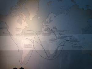
Starbucks map of coffee, July 2015. Photo: Jaime Ashworth.

I didn’t have to teach the following session on the Middle Passage, but the accounts of those voyages between Africa and the slave markets have remained with me. As Olaudah Equiano describes in his ‘Interesting Narrative’, first published in 1789:

At last, when the ship we were in, had got in all her cargo, they made ready with many fearful noises, and we were all put under deck, so that we could not see how they managed the vessel. … The stench of the hold while we were on the coast was so intolerably loathsome…. The closeness of the place, and the heat of the climate, added to the number in the ship, which was so crowded that each had scarcely room to turn himself, almost suffocated us. This produced copious perspirations, so that the air soon became unfit for respiration, from a variety of loathsome smells, and brought on a sickness among the slaves, of which many died — thus falling victims to the improvident avarice, as I may call it, of their purchasers. 

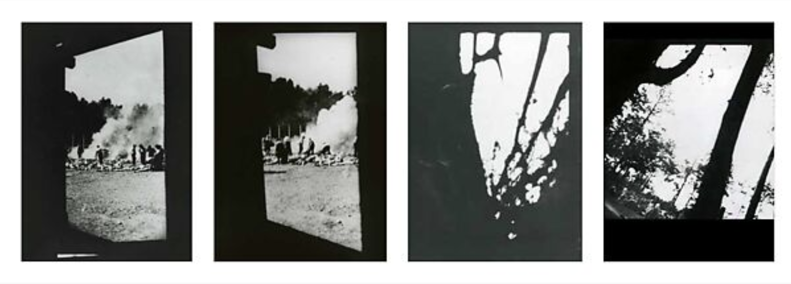
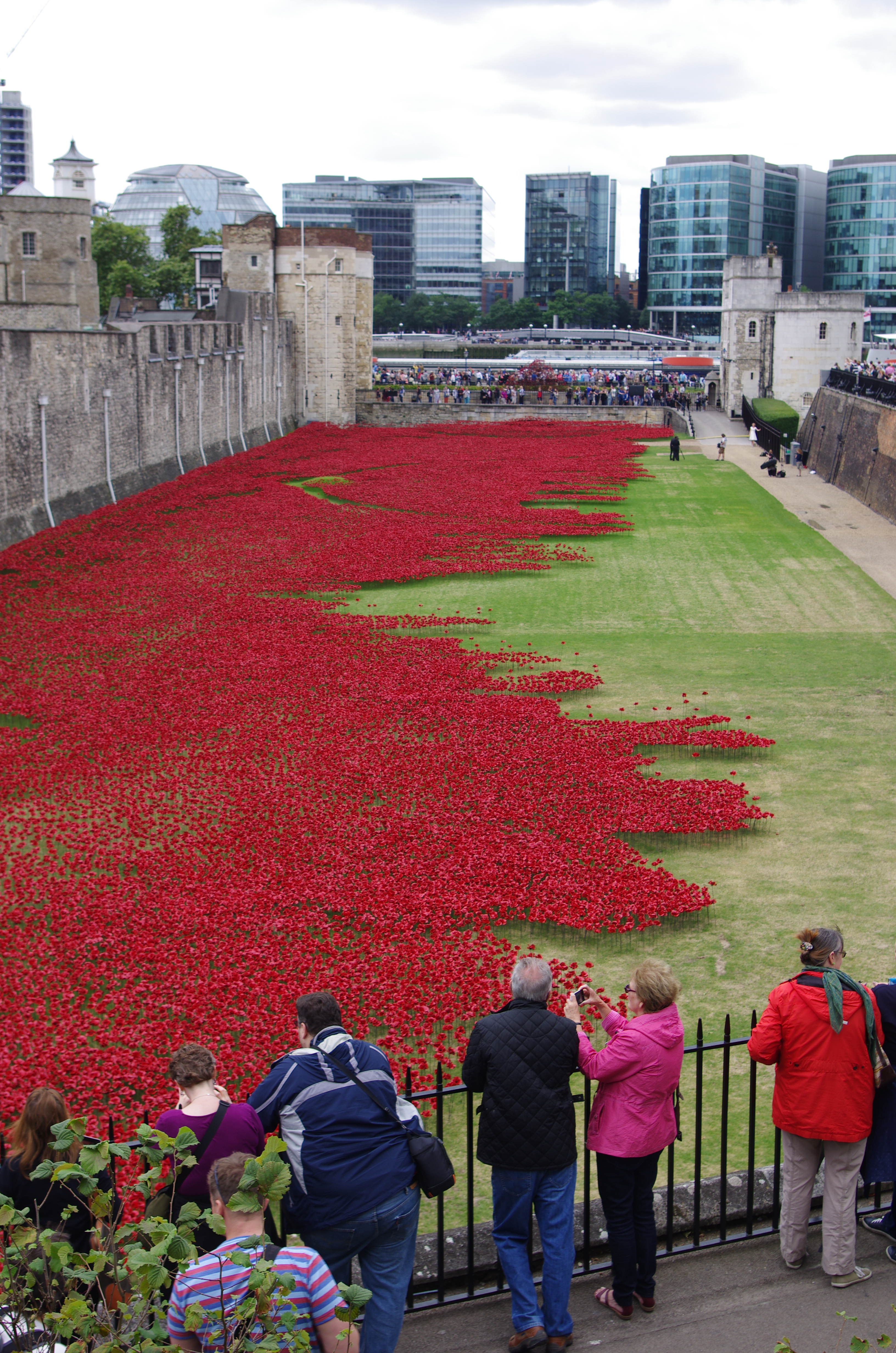
It is a measure of the awfulness that one of the most famous images of the abolition campaign, the Brookes illustration, shows conditions on board after legislation in 1788 to regulate the numbers ships were allowed to carry. The Port Cities: Bristol website explains that while the illustration shows 295 slaves packed into the vessel (with barely room to move), a previous voyage had transported 609. Borrowing a term from Terrence des Pres’s The Survivor on the degradation in the camps of the Third Reich, this was an ‘excremental assault’. Conditions reduced the slaves’ estimation of their own worth as ‘defilement was a constant threat, a condition of life from day to day, and at any moment it was liable to take abruptly vicious and sometimes fatal forms’ (des Pres, 1978: 57). As Equiano narrates: ‘with the loathsomeness of the stench, and crying together. I became so sick and low that I was not able to eat, nor had I the least desire to taste any thing. I now wished for the last friend, Death, to relieve me’ (Equiano, 2003: 56).

As in the Nazi camps, the assault kept others at bay. Other ships could smell the slavers for miles and avoided them and the miasma they carried: literally distancing themselves from the terrible reality, ‘stifling in common loathing the impulse toward solidarity’ (des Pres, 1978: 61).

The legislation of 1788 was introduced partly in response to the case of the Zong: a ship which left Africa in August 1781 with 442 slaves aboard. After 62 slave deaths from malnutrition and disease, the captain ordered that a further 78 be thrown overboard: the terms of the ship’s insurance were such that ‘natural’ deaths would not be compensated (to the slaver) but slaves jettisoned to save the rest of the (human) cargo could be. The conditions had done their work; ‘murder [was] less terrible to the murderers, because the victims appeared less than human’ (des Pres, 1978: 61) and ‘death could be administered with the conviction that so much rotten tissue had been removed from life’s body’ (Ibid.: 62).

Brookes illustration

The Brookes Illustration

Furthermore, although the Zong featured in abolitionist literature just as in contemporary curricula as a milestone on the road to abolition, the facts are less reassuring. The case was brought by the insurers out of a sense of financial rather than moral outrage and never properly resolved.

The connections between slavery and British wealth are well documented, not least in the National Maritime Museum‘s superb galleries on the Atlantic and the East India Company, the Liverpool International Slavery Museum and the Legacies of British Slave-ownership project at UCL. But the gap in everyday discourse represented by the single reference in Starbucks to the Caribbean was striking.

While on leave in Paris, a naval officer took a sprout and transported it back to Martinique. Once returned to the Caribbean [it?] thrived and is believed to be father of many Coffea arabica trees alive today in Central and Latin America.

The web of imperial and colonial power that took the plant from Africa to Paris and thence from Paris to Martinique is obscured by the statement itself. It is an example of what Barthes termed the privation of history, in which historical language ‘is a kind of ideal servant: it prepares all things, brings them, lays them out, the master arrives, it silently disappears: all that is left for one to do is enjoy this beautiful object without wondering where it comes from’ (Barthes, 2000: 178-179).

Am I not a man and a brother?

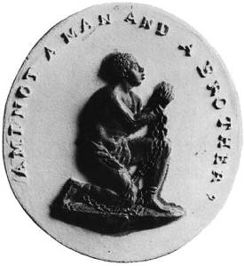
Wedgewood anti-slavery medallion copied from the seal of the Anti-Slavery Society.

It is not coincidental that this project begins with a link between the past and addictive consumption: eeven imperial defender Niall Fergusson notes the importance of the new stimulants in British imperial expansion: the Empire, he writes ‘was built on a huge sugar, caffeine and nicotine rush’ both commercial and physical (Fergusson, 2003: 15). Christopher Keep and Don Randall have read the ‘relationship between the imperial imaginary and the psychic economy of addiction’ (Keep and Randall, 1999: 208) into the Sherlock Holmes story The Sign of Four as one of the ‘stories which the Empire told to itself’ (Ibid.: 207) in order to ‘authorise, legitimise and mythologise its campaigns of material and economic exploitation’ (Ibid.: 219). The Ibis trilogy by Amitav Ghosh depicts this process from the perspective of the colonised, drawn into a global web of trade, power and exploitation.

History consists of both voices and silences, and the latter are hard to address. As Gayatri Chakravorty Spivak famously and despairingly noted, ‘the subaltern cannot speak’ (Spivak, 1988: 308). Hugh Thomas, in his magisterial history of the slave trade, comments: ‘The slave himself is a silent participant in the account […] an unknown warrior, invoked by moralists on both sides of the Atlantic, recalled now in museums in one-time slave ports from Liverpool to Elmina, but all the same unspeaking, and therefore remote and elusive’ (Thomas, 1997 : 799).

The gendered language as Thomas comments on the gaps in the record is ironic testimony to the problem he identifies, his formulation eliding the possibility of an alternative which recovers the voices and histories of women and children. The question posed by the abolitionists – Am I not a Man and a Brother? – is once more problematised: certainly a man (not a woman or a child) but still not a brother, or at least only a younger, subservient one to be pitied. The figurehead carved for the Royal George yacht in 1817 stands in the National Maritime Museum. The information notes that its figures (copied from the Wedgewood medallion) ‘indicate[s] how much anti-slavery imagery and language had pervaded British society by the early 19th century’ but I can’t help seeing in it the persistence of a hierarchy: grateful supplicants to royal mercy.

Royal George figurehead

Detail of the ‘Royal George’ figurehead, National Maritime Museum, Greenwich. Photo: Jaime Ashworth, 2015.

The silences of the Starbucks map set me thinking about the need for educational resources to fill these silences. As a history teacher, I am very aware that as Alison Kitson and Chris Husbands put it, ‘the selection of what we teach, as well as how we teach it, directly confronts our assumptions about ‘usable’ or ‘significant’ knowledge’ (2011: 133).  If we see the construction of curricula as ‘a selection and organization from the available knowledge at a particular time’ (Young, 1971: 24), justified by assumptions about culture and ‘fields of knowledge’ (Stenhouse, 1975: 19) and who can be seen as a ‘legitimate author’ (Apple, 2000: xxviii) we can also see ‘disciplines’ and ‘subjects’ as social constructs which serve to replicate power relations. One does not have to be a Foucauldian to partner ‘discipline’ with ‘punish’ or to see the linkage between the elision of historical slavery and the obscuring of the nature of the supply chain to the modern consumer: I can’t answer the question that acts as a heading to this section.

These elisions are what Heidi Safia Mirza terms ‘embodied intersectionality’: the physical manifestation of ‘patterns of power and ideology that reproduce inequalities based on race and gender differences’ (Mirza, 2009: 2). Silences of the type embodied in the Starbucks map are perhaps the most insidious practices which go toward creating ‘gendered, raced, classed, colonised, sexualised ‘others’’ (Mirza, 2009: 3) since it is difficult to become aware of them, much less confront or challenge them. #missinghistories is intended to be a way for different voices to express themselves. The conundrum of whether a white middle-class heterosexual male can even raise this without being patronising is probably irresolvable: the reader will have to trust my goodwill.

Practically, an INSET training by Mirza helped me articulate the power of educational resources in addressing these patterns by exploring and exploiting the gaps created in the language of history itself. I had already designed a session intended to problematise the use of the word ‘mulatto’ in a historical analysis in response to comments by students of Afro-Caribbean descent at earlier material, and continued to draw attention to the language in which (in the Barthesian formulation) the past was spoken. Looking at Indian participation in WW1 from the perspective of work by David Olusoga (2014) and Santanu Das (2014) both challenged the dominant narrative that reduces it to a ‘tragic but monochrome European feud’ (Olusoga, 2014: 424) and allowed students to make links between historical writing and empire.

Samples of all these resources (suitable for AS History) are available to download on the #missinghistories page, along with an elaboration (missinghistories) of the project’s concrete outcomes.

Conclusion

IMG_0888
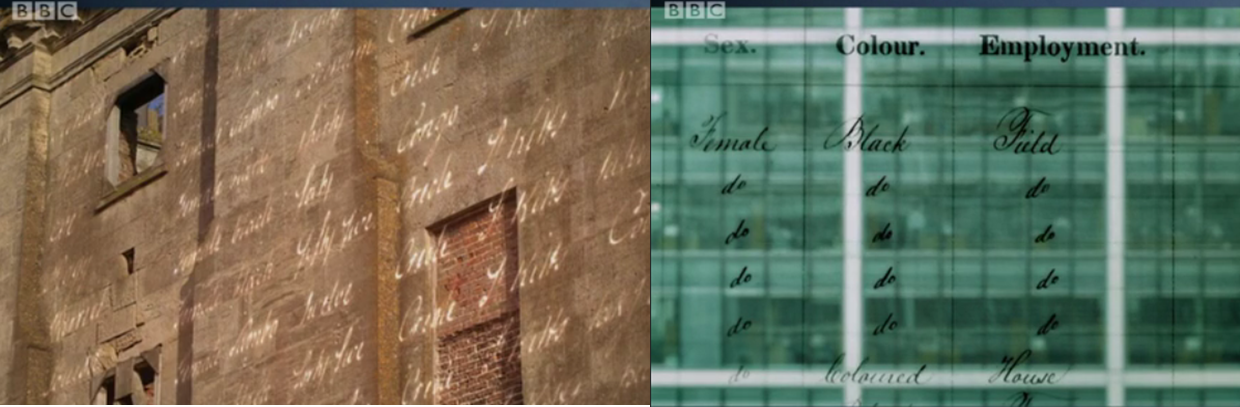
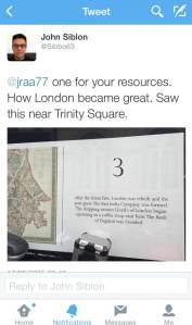
Amitav Ghosh has written that “the only people for whom we can even begin to imagine properly human, individual existences are the literate and the consequential . . . the people who had the power to inscribe themselves physically upon time”. In his novels, he inverts this significance by making the coloniser speak in a historical patois that is hard to comprehend while his ‘colonised’ characters are narrated in lucid and limpid prose. Supplying #missinghistories helps us to perform a similar inversion where ‘alternative’ sites of memory (Nora, 1989) can become part of the narrative of the city and so change it. In the recent documentary Britain’s Forgotten Slave Owners, projections of the registers of those who claimed for compensation were superimposed on contemporary London: #missinghistories allows us to do this over time and for many other stories. A tweet from my placement colleague John Siblon is a model of how twitter might be used to do it: why was the East India Company formed? How did the growth of the port affect the coffee shop? What was the role of the Bank of England? We can ask these questions on the move.

More broadly, therefore, these rewritings of the problematic representation or non-representation of the past change the city in which they are found. Michel de Certeau described the city as composed of ‘unrecognised poems’ (de Certeau, 1988: 93) of meaning in relation to space and time. The voices of Londoners could rewrite this poem, creating new ‘trajectories and alterations of spaces’ (Ibid.) that send thoughts and everyday habits along new figurative as well as literal avenues. If you attended the London Open Garden Squares event earlier this year, you will know the way your eyes are opened in new ways by finding somewhere you’ve never been before. If you went to the Clay Cargo event at King’s Cross, you’ve seen the power and beauty of Londoners literally remoulding the fabric of the city in their own image. By filling in #missinghistories we are actually creating a new history which in turn opens up a new future. Hopefully, by rewriting and remapping the city in which we live, we can change the lives that are lived within it.

composite landscape

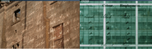
Stills from ‘Britain’s Forgotten Slave Owners’. Copyright of originator.

What we want…

From the public: photos of representations or non-representations of the past that fascinate, infuriate or just simply amuse.

From educators: teaching resources designed for use in addressing representations or non-representations of the past, or linking local points of interest to the formal curriculum.

From institutions and organisations: links to the resources designed already for use with exhibitions and sites, with as much detail about the exhibition or site as possible.  

Post to Twitter (@missinghist) with the hashtag #missinghistories or post direct to the page on this site. 

Truth and Memory, 1914-2014

17 Sunday Aug 2014

Posted by jaimeashworth in Culture and Politics, Heritage Politics, Photography and Visual Culture

≈ Leave a comment

Tags

Blood Swept Lands and Seas of Red, David Olusoga, First World War, Imperial War Museums, IWM First World War Galleries, Paul Cummins, representation, Roland Barthes, WW1 Centenary

IMGP1695 Detail from Paul Cummins, ‘Blood Swept Lands and Seas of Red’, July – November 2014. Photo: Jaime Ashworth, 2014.

In The Missing of the Somme, his 1994 meditation on the legacy of the First World War, Geoff Dyer suggested that ‘in terms of remembrance the years 2014-2018 will represent the temporal equivalent of a total eclipse. By then no one who fought in the war will be alive to remember it.’ While the concrete prediction was unsurprisingly accurate (though Harry Patch, ‘The Last Fighting Tommy’ died only in 2009) the weight of coverage and number of memorials mean that it can hardly be considered an eclipse. Visiting the newly renovated Imperial War Museum London and its new First World War Galleries and the installation by Paul Cummins at the Tower of London, Blood Swept Lands and Seas of Red, I have been struck not just by the sheer numbers (the IWM galleries have timed tickets to cope with demand) but the intensity with which people have engaged. For an event which has passed out of living memory (for combatants at least) it is remarkably emotive still. Even allowing for the degree to which media attention will amplify/produce/manufacture interest the response has been impressive. According to 1418Now, three million homes turned out their lights and lit candles to mark the centenary on 4 August.

photo The ‘Truth and Memory’ logo. Photo: Jaime Ashworth, 2014.

There is no shortage of pieces explaining/asking ‘What WW1 did for us’, nor is there any dearth of historical research exploring the origins and significance of the conflict. What I want to do here is look at the way this is happening in relation to the terms ‘Truth’ and ‘Memory’ – employed by the IWM as the title for an incredible exhibition of their First World War art collection.

The exhibition is in two parallel galleries separated by the chasm of the central atrium. The first contains works produced during or very shortly after the conflict while the second houses works produced after, incorporating the major works produced for the Hall of Remembrance project abandoned in 1919 by the British War Memorials Committee. The tensions in this division are acknowledged by the logo: ‘truth’ dissolving upward and ‘memory’ resolutely solid beneath. As the introductory panel notes, the ‘truth’ gallery contains works that ‘challenged established ideas of war and in turn redefined notions of the “truth”’. The gallery for ‘memory’ is intended to display evidence of ‘the central role envisioned for British art in commemorating the First World War’ – apparently underpinned by ‘the belief that art alone could convey the legitimacy of Britain’s cause and the nation’s sacrifice.’

Walking through the exhibition, my respect for the art itself was only slightly offset by disquiet at the ideas behind it. If there was a redefinition of ‘truth’ then how did that work? Did William Orpen’s use of biblical motifs redefine or reinforce them? Iconoclasm or even theodicy can be the sincerest forms of worship. Was the ‘grizzly truthfulness’ of Percy Delf Smith’s The Dance of Death a challenge to established ideas? Employing the medieval allegory of the Grim Reaper seems to emphasise continuity rather than challenge. Conversely, can anyone stand in front of John Singer Sargent’s Gassed and see ‘the legitimacy of Britain’s cause and the nation’s sacrifice’ without any hesitation or question? These questions, of course, are in the context of a breathtakingly thorough exhibition that needs to be seen and reflected upon.

The tensions between the concepts are nonetheless there, and unsurprisingly so. Truth will always require formulation and to that extent will be partial, at least in its expression. Memory presupposes that something is being remembered – which means that the scope of the imagination will come up against the facts of what happened. As Barthes put it, there is ‘stupefying evidence of this is how it was, giving us, by a precious miracle, a reality from which we are sheltered’ – the reality being the truth which can only be partially expressed.

IMG_0367 From the IWM London First World War Galleries. Photo: Jaime Ashworth, 2014.

Rather, therefore, than seeing a binary, on/off relationship between truth and memory, I see a spectrum of what I term mythology. Building on the work of Barthes, I see our engagement with the past as resulting from a tension that starts with an awareness that there is always ‘a language in which we speak of something’ which creates and defines the gap between what happened and how (or whether) we can speak of it – or if in fact we can sometimes stop speaking. This is about resonance and allusion, conscious or unconscious, of the period and/or anachronistic. Thus the title of William Roberts’s 1918 The Gas Chamber summons associations that are at once anachronistic and relevant. The chamber Roberts depicts is for training soldiers in the use of gas masks but at the same time the experience of gas attacks as both perpetrator and victim had a legacy in the death camps of the Third Reich, though it would be a mistake to join the concepts as though with a ruler. We need to remember Johan Huizinga’s injunction (quoted by Dyer) to ‘put ourselves at a point in the past at which the known factors seem to permit different outcomes’ and simultaneously know that it did happen a certain way and not another. In short, an awareness that we are not dealing with the object ‘memory’ but the act of remembering. Not mythology but mythologisation.

To achieve this, a museum needs to tread a path between explanation and play-acting that explains and illustrates the experience without confusing it with the reality that is being described. Not “I have been in a trench from the First World War” (which is patently false) but “I have enough insight to know what I can never experience”. The Blitz Experience and Trench Experience that used to occupy the parts of the building that are now the First World War Galleries used to fall into the trap of trying to recreate a reality which could not be recreated. The Dutch journalist Geert Mak wrote of sitting in a ‘fairy-tale air-raid shelter listening to the howl of the sirens and the thudding of the Heinkel bombers’.

More recent exhibitions such as the permanent Holocaust Exhibition and In Memoriam (commemorating the ninetieth anniversary of the end of the First World War) have succeeded, however, in precisely the terms I am talking about, using installation and artful display spaces to suggest the experience of what is being described rather than indulging in theatrics that leave the visitor aware that it was just a fairground ride. In clearing out the ramshackle dioramas and glass cases of the First and Second World War exhibitions the challenge was to produce a space that provided information and experience in ways that are accessible and thought-provoking. The new galleries succeed in this with remarkable sophistication.

IMG_0290 Paper soldiers go to war. IWM London First World War Galleries. Photo: Jaime Ashworth, 2014.

A phenomenal array of exhibits and artefacts fill an exhibition space which crawls with explanations and questions, not asking you to imagine you are there but challenging you with the question; can you imagine this? Making your jagged way through the exhibition, the structure allegorises ‘The Trench’ while the lapidary scansion of the information panels constantly draws attention to the language in which they speak. One of the final panels reminds us that ‘Different generations/ have taken different standpoints/ as to what the war meant/ and we still grapple with its meaning today’. It is a brave choice to end a historical exhibition in such a significant location with questions about what is contained therein but this is what the IWM has done. In keeping with the awareness in its Corporate Plan that there is no end in sight to its role as ‘a global authority on conflict and its impact, from the First World War to the present day’ it offers questions. The present day is a moving target and answers are therefore provisional.

IMGP1551 A visitor to IWM London engages with ‘Queen and Country’ (Steve McQueen, 2006). Photo: Jaime Ashworth, 2014.

And this is not isolated but clearly a strategy that the future will maintain. In the post-1945 galleries, bringing Queen and Country by Steve McQueen into the body of the museum does this: on the day I visited, two staff members were watching visitors explore the work and murmuring approvingly at the interaction – in contrast to its previous splendid isolation next to Sargent’s Gassed. On the same floor, Mark Neville’s Bolan Market – footage taken from inside an armoured vehicle on patrol in Afghanistan – puts the visitor uncomfortably into the shoes of an occupier, the scowls and fear-struck faces leaving you in no doubt of the relationship between watcher and watched. And all through the ‘temporary’ Galleries, the thoughts of curators, designers and historians emphasise the constructed nature of the museum, forcing a confrontation with the means by which the story has been spoken. There is always emphasis on the work of memory, returning the responsibility to find answers to the visitor.

IMGP1682 ‘Blood Swept Lands and Seas of Red’ (Paul Cummins, 2014) at Tower Hill. Photo: Jaime Ashworth, 2014.

It is this kind of work that I missed when visiting Tower Hill to see the installation by Paul Cummins, Blood Swept Lands and Seas of Red, which is slowly filling the moat of the Tower of London with 888, 246 ceramic poppies to remember ‘every death among the British and Commonwealth forces between 1914 and 1921’. No crowd of the size that was there will ever be silent – life, after all, goes on – but many individuals were. Many wiped away tears.

But the novelty will fade. The weather will be less conducive to standing and watching this creeping static tide. And at that point the questions come. For a start, British and Commonwealth? Surely you mean Empire? David Olusoga’s passionate and critical The World’s War: Forgotten Soldiers of Empire has told the stories of some of those whose tomorrows were not ‘given for our freedom’ but rather mortgaged by their Imperial landlords. Talking of the Boys’ Own retelling of Paul Lettow-Vorbeck’s brutal campaign in Africa (entitled Heia-Safari!), Olusoga fixes the camera in the eye and says very clearly: “But I can’t see it like that. Because I was born here.” In the previous episode he was seen to physically recoil from some of the aggressive racism in propaganda about the colonial troops. It’s this kind of aggressive and visceral counter-narrative that installations like Blood Swept Lands and Seas of Red negate in their scale and pure emotional appeal, smoothing away problems with a form that renders all casualties in one colour, blending all, servant and master, officer and soldier, ruler and ruled, into one egalitarian mass.

And over the road from the Tower, a memorial to the Merchant Navy of 1914-18 stands all but ignored by the crowds. Have you forgotten yet? This question begins Siegfried Sassoon’s ‘Aftermath’, which goes directly on to describe how ‘the world’s events have rumbled on since those gagged days,/ like traffic checked while at the crossing of city ways’.

Solid and reassuring answers are in many ways the best indicator of a problem. Like the mannequin in Colin Self’s 1966 The Nuclear Victim (Beach Girl), answers and questions should be textured and challenging rather than smooth and accommodating. The IWM renovation works because it demands engagement from the visitor: as I looked at the work by Self, I heard a boy (maybe twelve) ask ‘Dad, what’s happened to her? What’s happened?’ his alarm increasing with repetition. The other reason the IWM works (and why museums in general can work)  is because finding out demands from the boy and his father (and others just like them) an active enquiry.

The confrontation between those who favour ‘smooth’ interpretation and representation and those who reject such in favour of more ‘worked’ or ‘textured’ answers has been in the offing all year.  Michael Gove’s sniping contempt for ‘left-wing historians’ indulging in ‘misrepresentations which reflect an, at best, ambiguous attitude to this country’ can (for me) be detected in passive-aggressive form in many of the injunctions to ‘remember’ “all those who gave their lives for us to live free” which fill Twitter feeds and Facebook pages and newspapers and all the other ways that ‘public opinion’ asserts itself. I remember them. As brave men who were scared. As good men who did terrible things. For a good cause, for a bad cause, for no cause at all. Because they wanted to and because they were compelled or even forced to. But I try to do so in as many of these ways as possible, knowing that all (and none) are true. But in the trying, I remember.

IMG_0397 A detail from the IWM London First World War Galleries. Photo: Jaime Ashworth, 2014.

Totalitarianism: By the People, For the People

12 Wednesday Jun 2013

Posted by jaimeashworth in Culture and Politics, Photography and Visual Culture

≈ Leave a comment

Tags

Afrofuturism, British Library, Ellen Gallagher, Emplotment, GCHQ, NSA, Prism, Propaganda: Power and Persuasion, Tate Modern

Image

A US War Bond Campaign from 1918 remains chillingly relevant to this week’s news. Photo: Jaime Ashworth.

The essence of propaganda is to capture the imagination so thoroughly that the mind has no choice but to follow, holding you in thrall with the medium so the message is absorbed and accepted without question. Propaganda: Power and Persuasion at the British Library succeeds because its presentation is as compelling as its analysis.

This has been a week when the issues of consent, control and information that underlie any discussion of propaganda have been very important. Internationally, the revelations around Operation Prism and the mining of data have raised these questions particularly sharply, while in the UK the continuing row over the history curriculum and the plans to commemorate the 1914 centenary through ‘objective facts’ are also relevant. Most pointedly, this week the Russian Duma passed legislation making it illegal to spread what it termed ‘homosexual propaganda’, which it seems to equate with simply being homosexual. The question of how we navigate between education which teaches us how to think and propaganda which tells us what to think is not a relic, any more than it was in 2007-2008 when the Imperial War Museum put on the related exhibition of war posters, Weapons of Mass Communication. David Welch, in his beautifully produced book accompanying this exhibition, outlines the continuing tensions and fault lines very concisely, perhaps setting out the case for a detoxification of the word propaganda better than the exhibition does.

Welch’s concern for the negative connotation of the term propaganda raises very acutely the problems surrounding the limits of language to express anything without imposing some kind of register or significance on what it describes – what has been termed the problem of emplotment. Earlier this week I added my name to an open letter to the Prime Minister and Education Secretary which claims that the proposed history curriculum runs counter to the 1996 and 2002 Education Acts. It refers to a petition to ‘Keep the History Curriculum Politically Neutral’, opposing the promotion of ‘a nationalist political agenda [which] will stop history being a vehicle for teaching critical thought.’ This is a worthy and well-intentioned campaign, which does not (in all fairness) make clear what the author of both letter and petition propose to teach instead and why (and indeed how) that is neutral. I am, if not a Marxist, then certainly a leftie – and if I weren’t, Michael Gove excoriating Marxists and lefties would certainly increase my sympathy with them. At the same time, however, it is vital to maintain the distinction between ‘neutral’ and ‘what I happen to agree with’. To do otherwise is to engage in propaganda.

Image

Detail from ‘Page 1, Penelope’ (Joe Tilson, 1969) in the British Library foyer. Photo: Jaime Ashworth.

Underneath these issues is another conflict beautifully drawn out by the exhibition between integrative and divisive propaganda. Portraying the enemy is one thing, but it always goes alongside a definition of the collective, and official propaganda can acquire its own power as its themes are developed ad hoc by societies in ways that do not stay within the confines of doctrine. In his novel, The Woman Who Waited, Andrei Makine describes the way in which for many Russians ‘this slim consolation was all they had left: the belief that, thanks to their husbands, brothers or sons, Leningrad had not fallen.’ In the face of this kind of meaning being derived, the narrator concedes that the description ‘propaganda’ seems ‘a little on the terse side.’

In Britain, the work by Paul Addison and Jeremy Crang on the Mass Observation weekly summaries of the public mood highlights that across Europe this kind of information was collected to a purpose during World War 2. Seventy years later, many of the slogans and campaigns developed in response are part of the common cultural framework: Dig for Victory, Careless Talk Costs Lives, Coughs and Sneezes Spread Diseases,Make Do and Mend. All of these have been revived by the Imperial War Museum for their modern resonances with ecologically sustainable living. Even the duds – Keep Calm and Carry On was never widely distributed due to lack of response – have become a part of our discourse, as anyone who watched the Hungarian dance troupe Attraction win Britain’s Got Talent after a montage of soupy patriotism can attest.

We all have views on whether a message is good or bad that rely on criteria which are to varying degrees impervious to argument. Though Max Hastings this week seemed unclear about this, it is very hard to state ‘just the facts’ – and consequently retaining a firm grasp on when propaganda is bad is not as easy as it might seem. One of the sections in the exhibition is called ‘Nation’ and includes the following comment on the inclusive use of propaganda in the processes following decolonisation.

To succeed, new leaders had to build credibility and authority among their populations. Where nations included diverse cultures and perspectives, new rulers worked hard to create a sense of unified purpose.

Benedict Anderson suggests in Imagined Communities that this process is more of a cycle where aspirations and self-conceptions agglomerate to untidily form what we now term ‘nationalism’. Is a national self-awareness merely a form of propaganda? I was reminded of Yes, Prime Minister, where Bernard would formulate ‘irregular verbs’ to demonstrate hypocrisy: he might have said that I inspire; you preach; he spreads propaganda. Alistair Campbell is a talking head in the exhibition and praises the power of the 2012 Olympic opening ceremony with the simple (and telling) phrase ‘That’s country branding.’ Well, yes it is – but so was Triumph of the Will.

The difficulty in answering these questions is skilfully reflected in the exhibition design. Sections bleed into one another and so emphasise the commonalities between campaigns to (variously) smoke less or not at all, buy war bonds, take more exercise, realise the objectives of the Five-Year Plan, use a handkerchief, enlist in the army or have only one child. This last poster, for the One-Child Policy, was for me the most horrific in its concealment of awful, sustained (and continuing) suffering behind simpering glossiness. Though I am aware that others might find the insouciant sense of entitlement of the interwar Empire Marketing Board equally if not more deceitful. One man’s nostalgia, after all, is another woman’s history of bloody oppression. In moving the viewer to consider the contradictions and centrality of ‘our’ histories this exhibition is constantly engaging, challenging and informative.

In being so, however, the means by which this happens are slightly neglected. The diversity and quantity of what is on display is incredible in terms of both historical scope and geographical coverage. I felt at times, though, that a more focused look at why and how different forms and media, whether visual, plastic or performative, have their effects would have been useful. The throwaway reference to the ‘documentary style’ of Der Ewige Jude really needed to consider the range of visual and social criteria suggested by the phrase. As John Tagg put it in the title of his book, there is a burden to representation which this exhibition perhaps wears a little too lightly at times. I was struck by the analysis of one of Norman Rockwell’s ‘Four Freedoms’ posters: it took the individual image apart but did not address the way in which the campaign as a whole opposed the ‘Freedom from Fear’ and ‘Freedom from Want’ which were ‘Ours to fight for’ and the ‘Freedom of Worship’ and ‘Freedom of Speech’ – which were there to be saved (in all cases by buying War Bonds). Medium and message could perhaps have been isolated slightly more. In the same vein, I felt that amongst an abundance of manipulative polemic, any distinction between ‘propaganda’ and ‘anti-propaganda’ boiled down to very subjective and historically contingent judgements. And there were some missed opportunities in this context: for example the ironies of poacher turning gamekeeper. We have all, at some point, been more spinned against than spinning.

On a related note, I was struck by the way which the form of the exhibition encouraged a kind of ‘semiotic totalitarianism’ in some of its structures. Waiting to listen on individual headphones to some of the audio-visual material locks the visitor into their individual experience in a way which recalls Arendt’s idea of an ‘atomised’ society, with the possibility of debate and discussion closed off. The faceless mannequins, often with apposite quotations on their chests, are extremely ambiguous, recalling both the silenced individual and the faceless guard. Finally, the security guards who smoothly insinuate themselves as people try to take (forbidden) photographs bring to life the ultimate goal of propaganda: to control and define the terms of individual experience, if necessary by force but ideally by volition.

Image

A helicopter hovers over Central London, 11 June, 2013: the Evening Standard reported that ‘Police made arrests as they launched a crackdown to prevent rioting and serious disorder’ ahead of next week’s G8 summit. Photo: Jaime Ashworth.

Propaganda therefore requires surveillance: to tell people what they should think requires that you first know what they are thinking, so that can be either subverted or reinforced. Whether it’s called opinion polling, market research or preventive custody, and whether you get a free coffee or a trip to the camps as a result, the prerequisite of propaganda is the maintenance of supervision over the thoughts and activities of others. It requires, in short, the creation of a power structure of information and ideas. As a plaque in the office of a Nixon White House Staffer put it, ‘If you have them by the balls, their hearts and minds will follow.’

Once established, these structures are extremely resistant. Ellen Gallagher’s aggressive deconstructions of the racial and gender identities expressed through advertising are a case in point. As much as they attack the status quo, they are also exhibited within it (at Tate Modern) and thus to some extent tamed.

These are obviously very live issues this week, with the revelation that the NSA and GCHQ routinely obtain, store and analyse our data, often with the connivance of some very familiar – if not perhaps actually trusted – brands. In response, William Hague issued the standard bromide: that the innocent have nothing to fear. And it should be borne in mind that there is a lot to keep track of. The exhibition’s final installation, Chorus, 2013, consists of fifteen columns of Twitter posts, pulsing relentlessly across the field of view while being sorted in different ways. No eye could possibly monitor such action – and this is just a tiny fraction of the stream of data produced every second of every minute of every day. One has to wonder whether, just as to defend everything is to defend nothing, to collect such quantities of data is to render it permanently incomprehensible, certainly for the predictive purposes that some might suggest. So why collect it? So that when your crime is discovered (or more worryingly, defined) the evidence can be found? The innocent do have nothing to fear: but who decides who is innocent? How do I know they’re wrong? The real damage done by propaganda is its erosion of the essential trust that exists in a healthy society between government and the people.

Propaganda: Power and Persuasion is at the British Library (www.bl.uk/propaganda) until 17 September, 2013. Adults £9 (£10 with GiftAid donation), Under 18s free, Concessions available.

Ellen Gallagher: AxME is at Tate Modern (www.tate.org.uk) until 1 September. Adults £11, Concessions £9.50.

A Presence of the Idea of Her: The New Royal Portrait

14 Monday Jan 2013

Posted by jaimeashworth in Culture and Politics, Photography and Visual Culture

≈ Leave a comment

Tags

Kate Middleton, Paul Emsley, portrait, portraiture, representation

‘I think there were two reasons why I wanted an abstract painting. One is that I do not like looking at images of myself, the second reason is because I don’t like, to be truthful, most representational portraits I see nowadays. What I wanted was the presence of the idea of me, not of a record of the whole of my face that I don’t much like.’ – A. S. Byatt

 The first official portrait of Catherine, Duchess of Cambridge, by the artist Paul Emsley, was unveiled last week at the National Portrait Gallery, to almost universal disdain. In case you haven’t been near a newspaper or screen in the intervening period, here it is:

 ImageFigure 1: Catherine, Duchess of Cambridge. Paul Emsley, 2013. NPG 6956.

 The responses to the picture have been described as polarised, though I’ve seen (or heard) little that is positive about it. The Daily Mail described it as ‘rotten’ and in the Independent Michael Glover described it as ‘catastrophic’: ‘little other than a face […] which is beginning to look a touch dropsical.’ Charlotte Higgins in the Guardian said that the image transformed the sitter from ‘a pretty young woman with an infectious smile’ into ‘something unpleasant from the Twilight franchise’.

Pop culture references always set off alarm bells for me, raising the suspicion that the writer wants me to respond before (or instead of) thinking. And the snide tone of comments on Facebook and Twitter made me still more uneasy. In particular, the update that ‘[X] thought it showed great foresight to paint what the Duchess will look like after she’s given birth’ prompted me to give some serious thought about what was going on.

The term portrait is deceptive in its neatness. Like all ideas and practices with such an extended heritage, it has mutated and shifted, and carries with it the complexities of its previous incarnations. The criteria that one might use to either evaluate or even define a portrait – likeness, identity, representation – are ambiguous, muddying rather than clarifying the questions, let alone the answers. The notion of a ‘successful’ portrait makes things more difficult still, relying as it does on competing ideas about what or who a sitter ‘is’ both to themselves and others, or even what it means to represent someone. Even a short tour through the National Portrait Gallery presents these issues starkly.

For example, just a few metres down the corridor from the Emsley portrait (as I’m going to refer to it from now on) is Patrick Heron’s 1997 portrait of the novelist A. S. Byatt.

ImageFigure 2: A.S. Byatt (Portrait of A S Byatt; Red, Yellow, Green and Blue: 24 September 1997. Patrick Heron, 1997. NPG 6414.

As a likeness, this is clearly not intended to assist Byatt in, say, being identified by officialdom (though how many of us think we look like our passport photos?) As Byatt’s comment at the head of this piece makes clear, however, it is something else: a statement by artist, sitter and institution about what is important about Byatt. It is a site of debate about what Paul Moorhouse has termed the ‘veracity of the relationship between the subject and the depiction’ and the result of a process in which, as Peter Burke puts it, ‘artist and sitter generally colluded.’ Roland Barthes provided a characteristically loquacious summary of these issues in Camera Lucida, writing that in the portrait ‘I am at the same time: the one I think I am, the one I want others to think I am, the one the [artist] thinks I am, and the one he makes use of to exhibit his art.’ The tensions in this process are laid bare in Imagined Lives, a collection of stories by contemporary writers to imagine the antecedents of ‘unknown’ portraits in the NPG’s collection.  As Tarnya Cooper writes in her concluding essay, they are ‘lost souls whose quest for immortality has been only partially successful.’

Taking this idea of the portrait as a locus of competing projections of identity as a starting point seems to me to raise some more interesting questions than whether we ‘like’ the image or not. (Leaving aside the question of whether a binary like/dislike is a sufficiently refined tool with which to approach a piece of art.)

Firstly: why do we seem to assume that the subject is not in control of the depiction? In their essays on the depiction of the Queen for a Jubilee Exhibition in 2012, David Cannadine and Paul Moorhouse both draw attention to the problems of a situation where ‘the sheer quantity of visual information about the British monarchy is greater than ever, more easily accessible and harder to regulate.’ While this is true – and the Leveson enquiry last year asked difficult questions about both accessibility and regulation – this portrait is a different kind of statement. The result of a commission and co-operation between an artist with an extensive portfolio, a sitter with a degree in art history, and an institution with centuries-long experience of moulding public response, it seems unlikely that the picture is one that none of them predicted. Presumably, in fact, this portrait is at least intended to do something. It is certainly much more interesting to assume this is the case, because we can then ask what are the expectations /narratives that it seems to be contradicting or frustrating? The answer (I suggest) is in the headlines.

Michael Glover’s piece in the Independent is entitled ‘Paul Emsley’s Duchess of Cambridge portrait is catastrophic’. The sub-heading is: ‘The first official portrait makes Kate Middleton’s cheeks look hamsterish, and her face saggy and a touch dropsical, writes Michael Glover’. There is a clear tension here between ‘Catherine, Duchess of Cambridge’ (as the NPG lists the portrait) and ‘Kate’. In the Guardian, we find the same tension, reversed: Charlotte Higgins’s piece is ‘Kate’s portrait – straight from the Twilight franchise’ and the sub-heading: ‘The Duchess of Cambridge’s official portrait, by Paul Emsley, shows her washed-out, heavy-lidded and seemingly fanged’. So why has this image got everyone’s titles in a twist?

An important clue is on her right ear in the portrait: an earring, identified by the Daily Mail as belonging to Diana, Princess of Wales and featured in her appearance on the cover of Vogue in 1994:

Image Figure 3: Vogue, July 1994. Cover photo by Patrick Demarchelier.

Diana’s jewellery has been a big part of the image of ‘Kate’ in the last couple of years. In addition to the news coverage of the use by the couple of Diana’s engagement ring, the engagement portraits of the Royal couple (by Mario Testino) featured the ring (which incidentally bears more than a passing similarity to the earrings) in prominent part of the composition.

ImageFigure 4: Their Royal Highnesses the Duke and Duchess of Cambridge. Engagement portrait, Mario Testino, London 2010.

The beaming and girlish ‘Kate’ – enfolded in her fiance’s arms – is meant to recall her late mother-in-law: the angle and pose emphasise the similarities in facial structure, and the smiles are almost identical: compare with David Bailey’s 1988 image of Diana.

ImageFigure 5: Diana, Princess of Wales. David Bailey, 1988. (NPG P397)

Like Diana, ‘Kate’ looks straight into the camera: what kind of communication this is may be in doubt, but it is a communication.

In the new portrait, however, ‘Kate’ is no longer: instead ‘the Duchess’ gazes slightly out of frame, amused at a joke which we are not invited to share. Perhaps appropriately, this is a bid to create her own image rather than submit to the images of others, to impose the presence of her own idea of her. Whether that attempt is successful, of course, is another matter entirely. But neither she nor we can know that.

Bibliography

Roland Barthes (trans. Richard Howard), Camera Lucida: Reflections on Photography, Vintage Classics, London 2000 (French 1980)

Peter Burke, Eyewitnessing: The Uses of Images as Historical Evidence, Reaktion Books, London 2001

Media reaction:

Rebecca English, ‘I’m thrilled! Kate puts on a brave face as she sees first official portrait critics are calling ‘rotten’’, Daily Mail, 11 January 2013, retrieved on 14 January 2013 from http://www.dailymail.co.uk/news/article-2260655/Kate-Middleton-Rotten-official-portrait-Duchess-Cambridge-artist-Paul-Emsley-unveiled.html

Michael Glover, ‘Paul Emsley’s Duchess of Cambridge portrait is catastrophic’, The Independent, 11 January 2013, retrieved on 14 Janaury 2013 from http://www.independent.co.uk/arts-entertainment/art/news/michael-glover-paul-emsleys-duchess-of-cambridge-portrait-is-catastrophic-8448116.html

Charlotte Higgins, ‘Kate’s portrait – straight from the Twilight franchise’, The Guardian, 11 January 2013, retrieved on 14 January 2013 from http://www.guardian.co.uk/culture/charlottehigginsblog/2013/jan/11/kate-portrait-twilight-paul-emsley

National Portrait Gallery resources/publications

Case-study: Dame A. S. Byatt, retrieved on 14 January 2013 from

http://www.npg.org.uk/collections/new/commissioning-portraits/the-commissioning-process/case-study-dame-as-byatt.php

Imagined Lives: Portraits of unknown people. Fictional character sketches by John Banville, Tracy Chevalier, Julian Fellowes, Alexander McCall Smith, Terry Pratchett, Sarah Singleton, Joanna Trollope, Minette Walters, National Portrait Gallery, London 2011.

http://www.npg.org.uk/business/publications/imagined-lives-portraits-of-unknown-people.php

Paul Moorhouse, The Queen: Art & Image, National Portrait Gallery, London 2012

http://www.npg.org.uk/business/publications/the-queen-art-and-image.php


Recent Posts

  • On Holocaust Memorial Day, 2023: Ordinary People
  • On Holocaust Memorial Day 2022: One Day
  • Languages of the Holocaust
  • Where were you when…?
  • An Argument that Must Not Abate

Archives

  • January 2023
  • January 2022
  • October 2021
  • September 2021
  • June 2021
  • August 2020
  • July 2020
  • March 2020
  • January 2020
  • January 2019
  • November 2018
  • January 2018
  • September 2017
  • August 2017
  • February 2017
  • January 2017
  • August 2016
  • March 2016
  • August 2015
  • August 2014
  • June 2013
  • May 2013
  • April 2013
  • February 2013
  • January 2013

Categories

  • Book Reviews
  • Culture and Politics
  • Heritage Politics
  • missinghistories
  • Photography and Visual Culture
  • The Holocaust: Representations and Meanings
  • Uncategorized

Meta

  • Register
  • Log in
  • Entries feed
  • Comments feed
  • WordPress.com

Blog at WordPress.com.

  • Follow Following
    • framingthequestion
    • Already have a WordPress.com account? Log in now.
    • framingthequestion
    • Customize
    • Follow Following
    • Sign up
    • Log in
    • Report this content
    • View site in Reader
    • Manage subscriptions
    • Collapse this bar
 

Loading Comments...